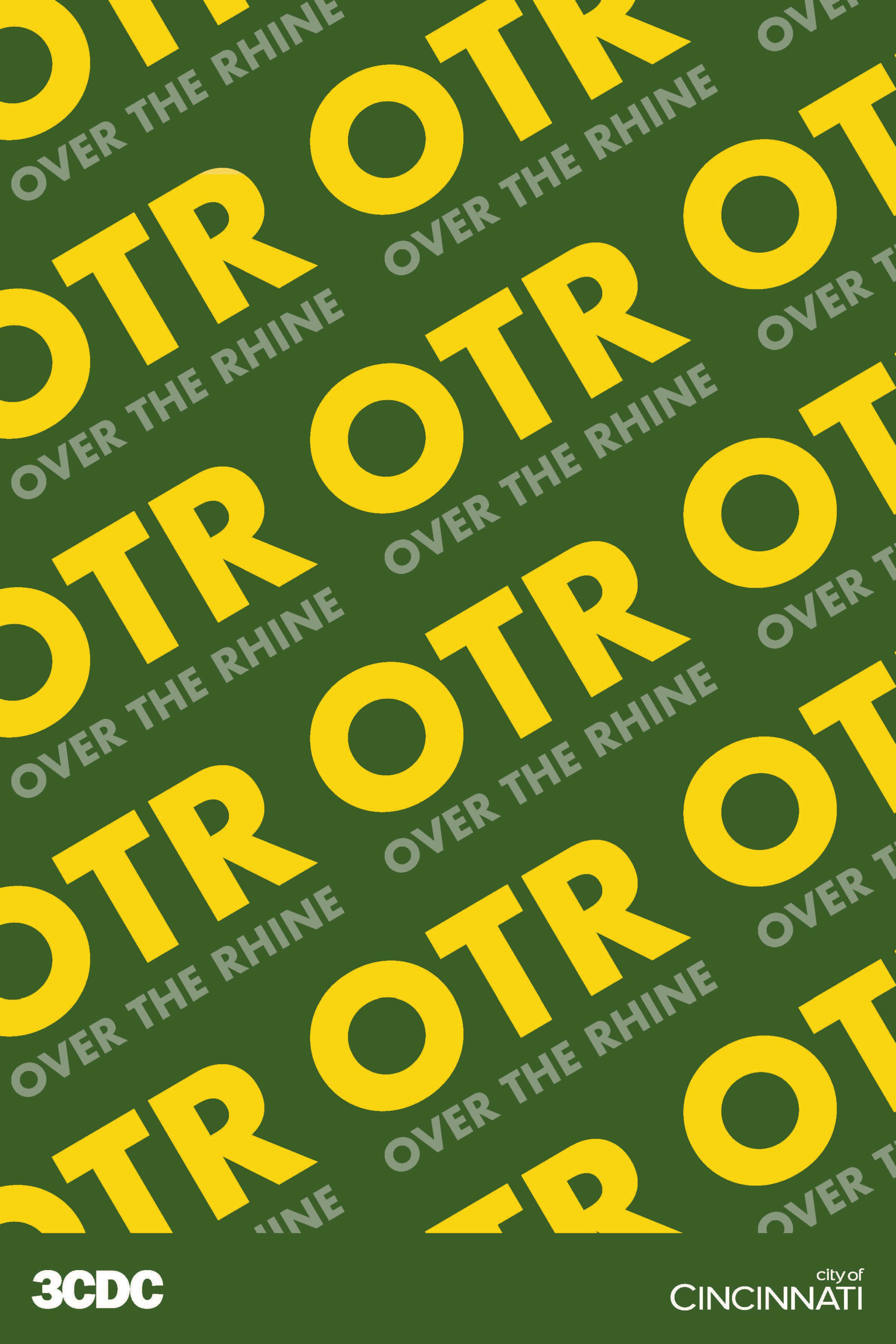
As the first public introduction of the new OTR branding, I designed a series of 45 posters that were installed throughout the neighborhood. Each poster served as a bold, eye-catching showcase of the new visual identity. I combed vibrant colors, expressive typography, and messaging that captured the spirit of OTR. Strategically placed around high-traffic areas, the posters helped spark curiosity and familiarity with the brand, acting as both art and advertisement. The posters also included nearby stores in OTR that were able to benefit from the new marketing strategy. To ensure consistency and guide future use, I also created a branding sheet that outlined the visual system, including logo usage, type treatments, and color standards. Together, the posters and branding sheet established a clear and confident visual presence for OTR in the public space.
OTR Rebranding - Phase 2
A few months after launching the initial OTR branding, we entered a second phase of the project to refine the identity based on feedback from the city. While the overall visual direction remained consistent, we made intentional adjustments like updating the color palette to better align with city feedback and ensure greater accessibility and flexibility across different applications. We updated the branding sheet to reflect these changes, providing clear guidelines for the revised system. To help bring the refreshed identity to life and expand its reach, I also created an animated motion graphic that introduced the new look in a dynamic, engaging format that was used across digital platforms and presentations.